
Please scroll down to read a interview with Cathleen Davidson, a interior designer who focuses on the selection of color and owner of Color Forte.
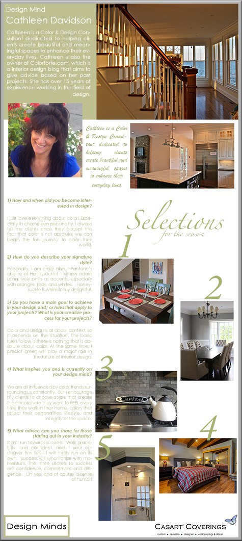
This week is all about color. (See Mary Douglas Drysdale’s Signature Colors) Selecting colors for a space can be a daunting task. I recently interviewed Cathleen Davidson who is a color consultant and interior designer dedicated to helping clients create beautiful and meaningful spaces to enhance their life. She is founder of Cathleen Davidson Design Studio Inc., and has over 15 years expertise in color and design. Her blog, Color Forte, offers expert color and design advice.

LLJ – Cathleen, let’s begin with some general questions and then talk about color. What do you foresee as being a major difference about the interior design industry in 15 years?
Cathleen Davidson (CD) – The green movement will play a major role. We are already seeing changes in lighting design, with the discontinuance of incandescent lighting. Color and design will have to adapt to a green approach. I don’t think we have much of a choice. It will continue, slowly, but surely. We must save the earth!
LLJ – What are some tips for making a smaller space appear larger?
CD – Color and design is all about context, so it depends on the situation. And there are many different approaches, but I’ll mention some general tips. Avoid high contrast and embrace simplicity. Don’t have too many different colors or light-dark values in the room. Contrasting colors create boundaries that stop our eye, and this makes a room appear choppy and smaller. An exception is the floor. Dark floors make a room look larger, because it anchors the room and the floor appears to recede down into the earth, while light floors tend to float upward, making the room appear smaller. Paint the ceiling a lighter color (once again keep the contrast low) or the same color as the walls for flow (in order to do this you must lighten the wall color a shade or two because color appears darker on a ceiling). And avoid high contrast on trim.
LLJ – And, conversely, what about making a large space appear cozier?
CD – If the ceiling is high, consider painting the ceiling darker than the walls to visually bring the ceiling down. But beware, painting a ceiling too deep of a color can actually do the opposite, and make the ceiling disappear, (kind of like the midnight sky). The more color, texture, motifs, accents, and interest you add to the walls, (within reason) the cozier it will feel. Warm rich colors can wrap a room up like a blanket and create intimacy.
LLJ- I feel cozier just thinking about that analogy! What fascinates you about color?
CD – Everything! Especially its chameleon personality. I always tell my clients once they accept the fact that color is not absolute, we can begin the fun journey to color their world.
LLJ – Do you agree that the paint color selection and finish are critical to the success of a room design?
CD – Oh absolutely. Color has the power to completely transform a space. Color affects us mentally, physically, and spiritually. How we choose to color our world affects our moods, and the quality of our everyday routines.
LLJ – I did a blog post recently on Pantone’s Color of the Year, Honeysuckle, https://www.casartcoverings.com/casartblog/the-secret-color-committee/ and now I see it featured in every magazine and catalog, . Are you and your clients influenced by the Pantone designation?
CD – We are all influenced by color trends surrounding us constantly. But I encourage my clients to choose colors that create the atmosphere they want to FEEL every time they walk in their home, colors that reflect their personalities, lifestyle, and integrity of the space. (Of course if it is staging project or spec home, it is a whole different game.) Personally, I am crazy about Pantone’s choice of Honeysuckle! I simply adore using lively pinks as accents, especially with oranges, reds, and whites. Honeysuckle is whimsically delightful.
LLJ – What are some color palettes that have “staying power”?
CD – White and black, gray and beige. white and off white. These neutral palettes are timeless and create a space that welcomes other accent colors.
LLJ – What is your favorite paint color to use for walls, ceiling and trim?
CD – Now that is a difficult question, color is all about context, and THERE IS ABSOLUTELY NOTHING ABSOLUTE ABOUT COLOR! But at the moment, I love warm taupes and grays in the main living area. When there is a breathtaking view, I prefer off-whites and colors that don’t distract on the walls to bring the outside in.

Dining rooms are great spaces for almost anything – including rich jewel colors.


Creamy soft yellows look beautiful in a kitchen with white cabinets, and I like more vibrant colors with dark cabinets. Blues and greens in bedrooms create sanctuaries, and bathrooms should be treated like spas. And there is nothing quite like a dark mysterious color in a library – so warm and thought provoking! Finished attics look vibrant the color of the sky, as does dark hallways and basements. And I feel strongly that sunrooms don’t have to be yellow. Recently, I recommended an intense deep blue in a sunroom that looks stunning. As far as trim, I am a fan of whites and off whites, but there are times a color is striking. Wood panels and beadboard look sophisticated with creamy whites and warm grays. And I treat ceilings as a fifth wall. One of my favorite colors for a ceiling is a gray blue to echo the sky. But remember, color design is not about a particular hue. It’s about how the color relationships get along with each other and the space to create an atmosphere. Designers have to juggle many elements- lighting, existing finishes, décor, style, etc. Sometimes a color simply doesn’t work in a space.
LLJ – What is the one best piece of advice you ever received that has contributed to your successful career?
CD – Don’t run towards success. Walk gracefully, and confident, and if your endeavor has feet it will surely run on its own. Success will synchronize with momentum.
LLJ – And my final question for Cathleen Davidson, the three most important secrets to your success are?
CD – Confidence, Commitment and Diligence. Oh yes, and a sense of humor!
LLJ – Thank you, Cathleen. Your passion for your work is evidenced by the thought and depth of your answers.


Lovely interview. Thanks for the opportunity to have a broader peek into Cathleen’s color philosophies. Agree that there is nothing absolute about color.